Making tax simple.

RIFT have helped Brits recoup more than £150m in tax refunds, and approached us to help simplify their online claim process.

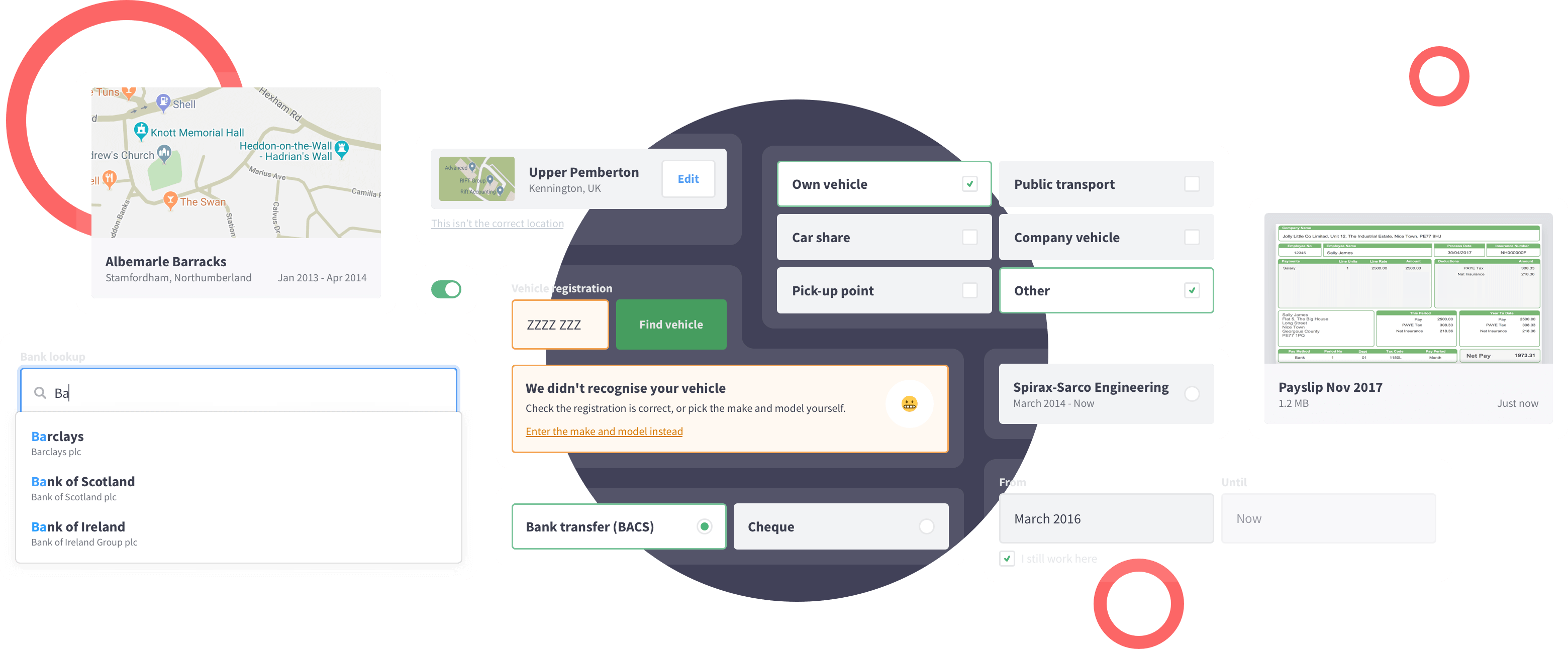
A collection of form elements used in MyRIFT to collect information from their customers, such as their address, bank, and vehicle registration.
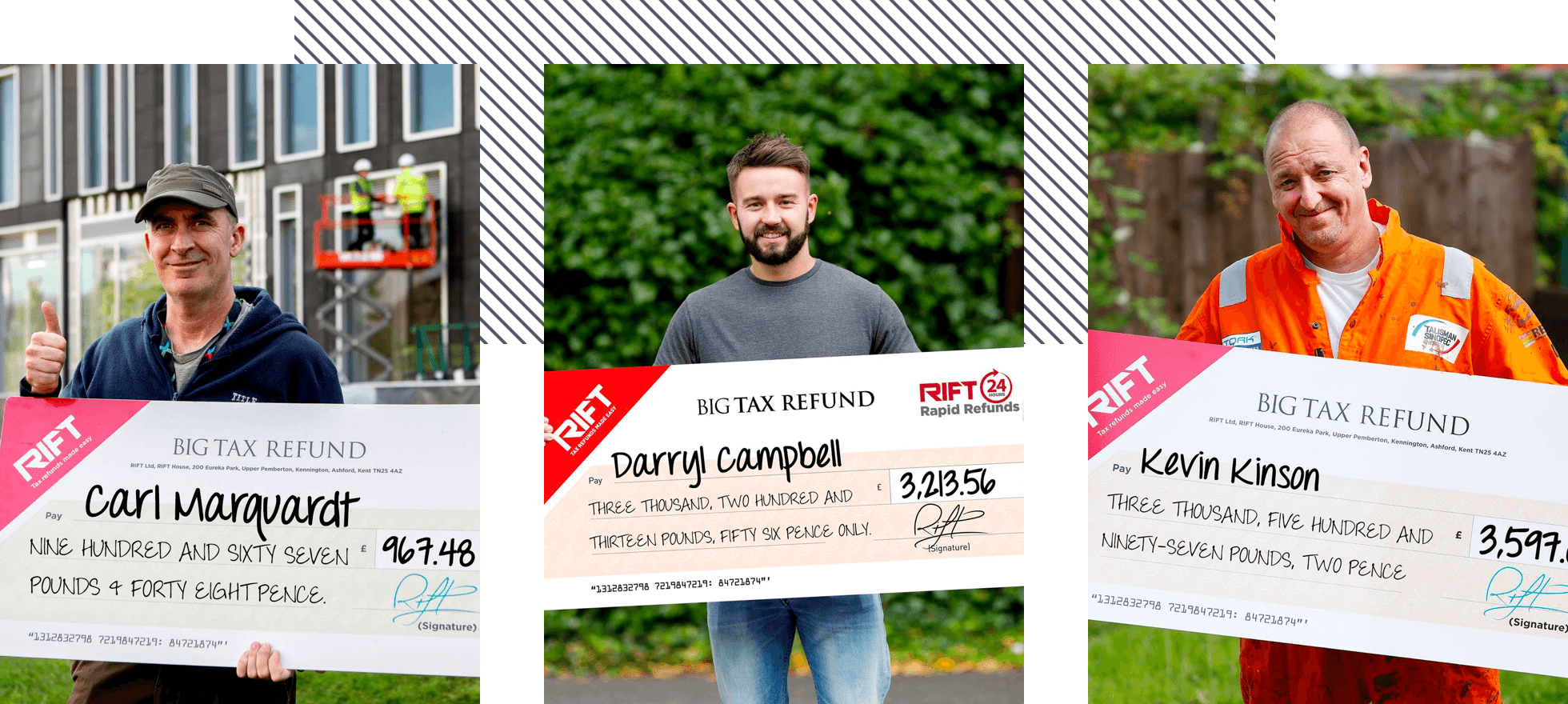
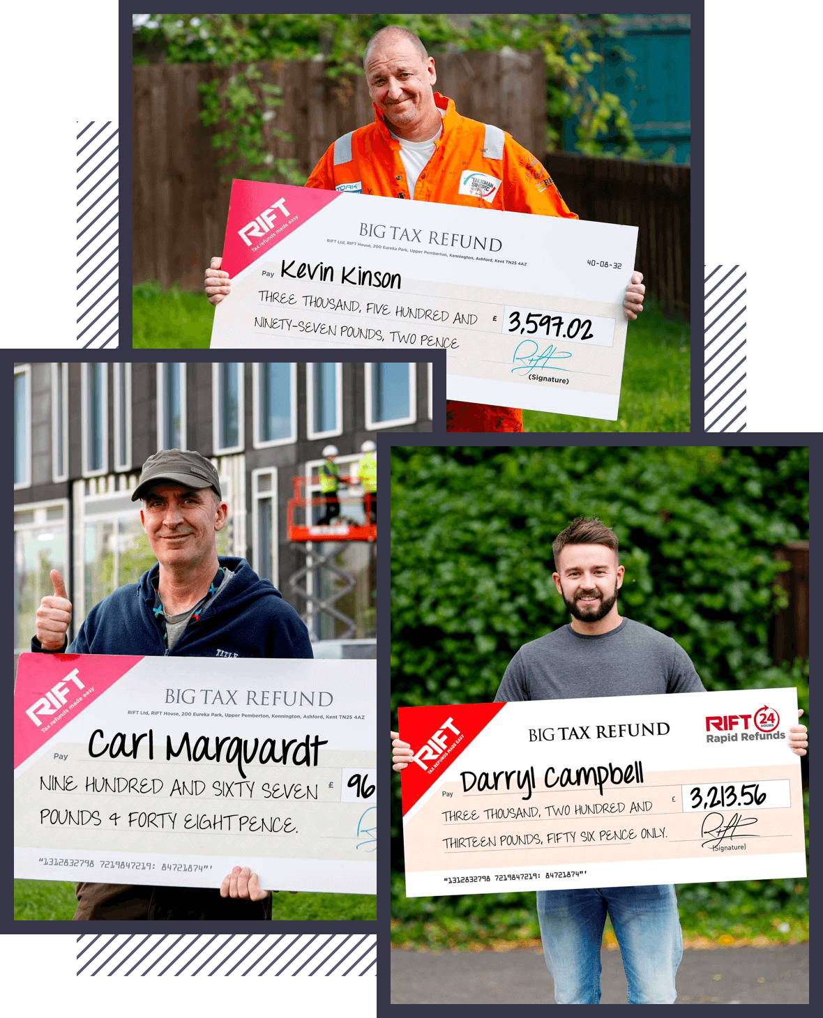
3 happy RIFT customers posing outside with their large TAX return cheques.

The challenge

RIFT’s customer-facing claim tool, MyRIFT, wasn’t effectively converting their online leads into successful claims.

We were tasked with more effectively qualifying leads before they signed-up to MyRIFT, and to help eligible claimants submit their claim information, all the while increasing the quality of any information being captured.
What we did

API data lookups

Content writing

Data analysis

Development

Form design

Journey mapping

Pattern library

Prototypes

Stakeholder interviews

Stakeholder workshops

Visual design

Wireframes

Our approach

  • Uncover existing pain-points

    Analytical software helps answer a range of questions, from how well an app is performing, to where users are struggling.

    We added Mixpanel to both the RIFT website and MyRIFT application, helping us to understand existing user behaviours, and to establish a baseline conversion rate for qualifying and converting new leads.

  • Understand the audience

    Many of RIFT's customers were in the Armed Forces, where Internet speeds are often slow and mobile usage is common.

    For MyRIFT to be considered a viable alternative to claiming through the RIFT Call Centre, we'd need the application to be optimised for small screens, and be reliable on even the slowest of network connections.

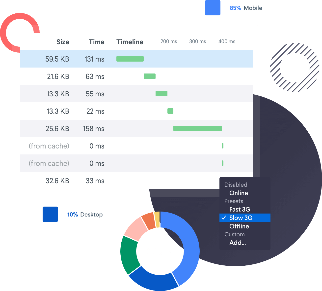
A download speed pie chart, as well as a preview of the analytics dashboard we used to measure the sites performance, and also find any existing pain-points for users.
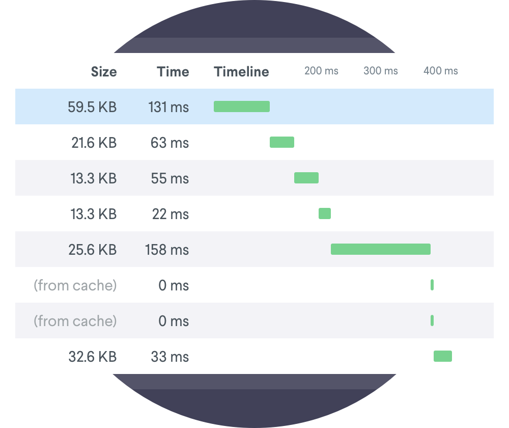
A preview of the analytics dashboard we used to measure the sites performance.

Move quickly and effectively

A combination of quick-fire sketches and wireframing help facilitate ideation and conversation in the most efficient way.

We relied heavily on low-fidelity prototypes in the early stages of our design exploration, helping us to quickly validate or discredit concepts, gain stakeholder buy-in, and ensure a single, shared vision.

A collection of wireframed form elements from the prototyping process. These elements consist of user information such as workplace locations, accomodation details and vehicle lookups.
Background shape
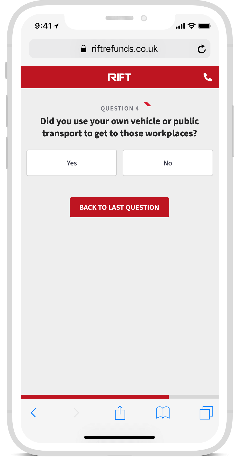
A mobile screen showing one of the steps from the initial eligibility questionaire. Did you use your own vehicle or public transport to get to those workplaces?

Focus on the lowest hanging fruit

Historical data highlighted the registration processes as a key point of failure in converting prospective claimants.

A simple questionnaire helped us to quality leads without any form of human intervention, which had been a feature of the previous eligibility process. We also replaced an existing enquiry system with a more conventional registration form, creating a more conventional sign-up process, and further removing manual involvement from the RIFT team.

Arrow
14,600

people checked their eligibility in April 2020.

Painless document uploads

To prove their income and outgoings, users have to provide a range of documents as part of their claim.

Claimants previously sent their files to a dedicated email address, meaning documents turned up in all sizes and formats, and the RIFT staff had to routinely manage the Inbox. We created a document upload system, allowing claimants to upload any number of wage slips or bank statements in a single action, and without any involvement from the RIFT team.

Arrow
1,000+

files are now uploaded in MyRIFT each month.

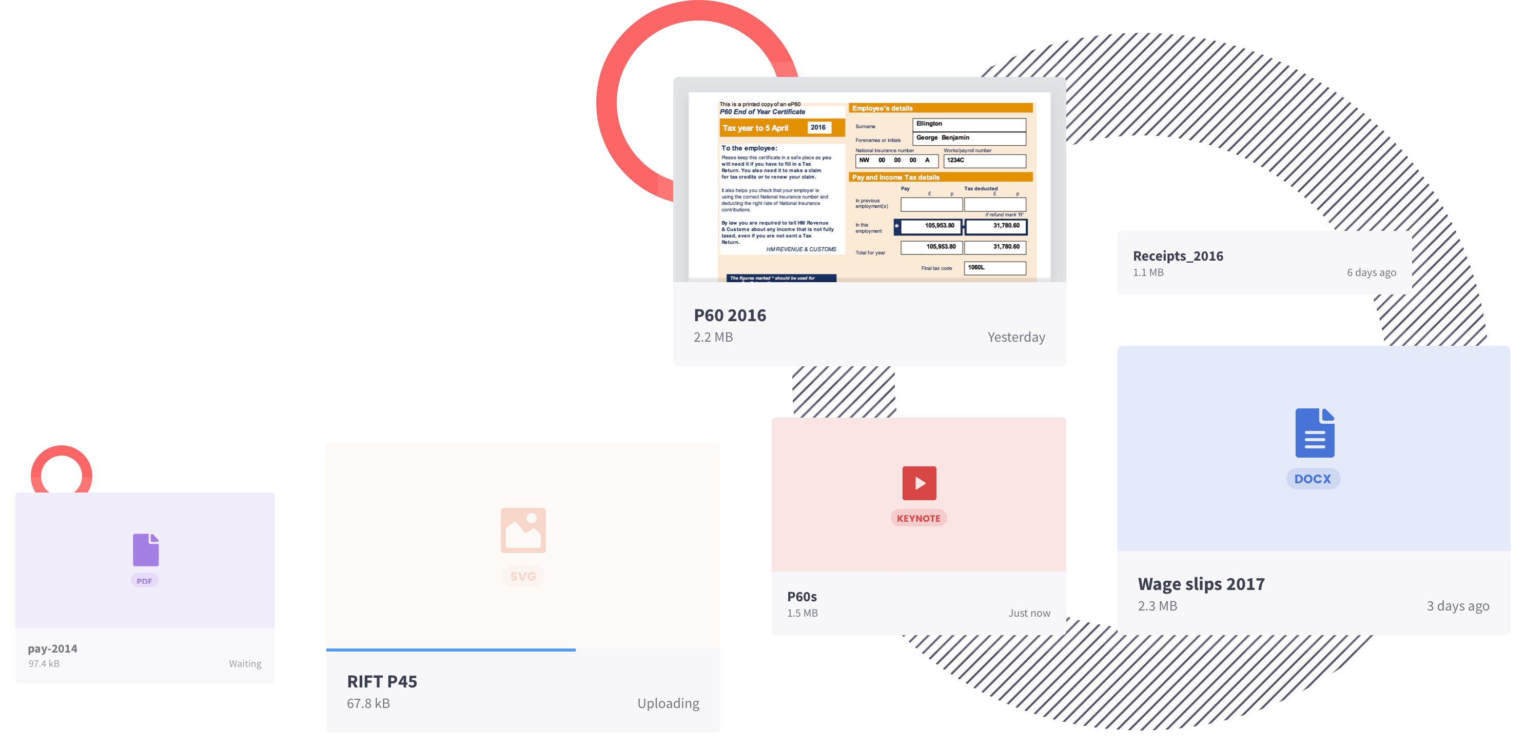
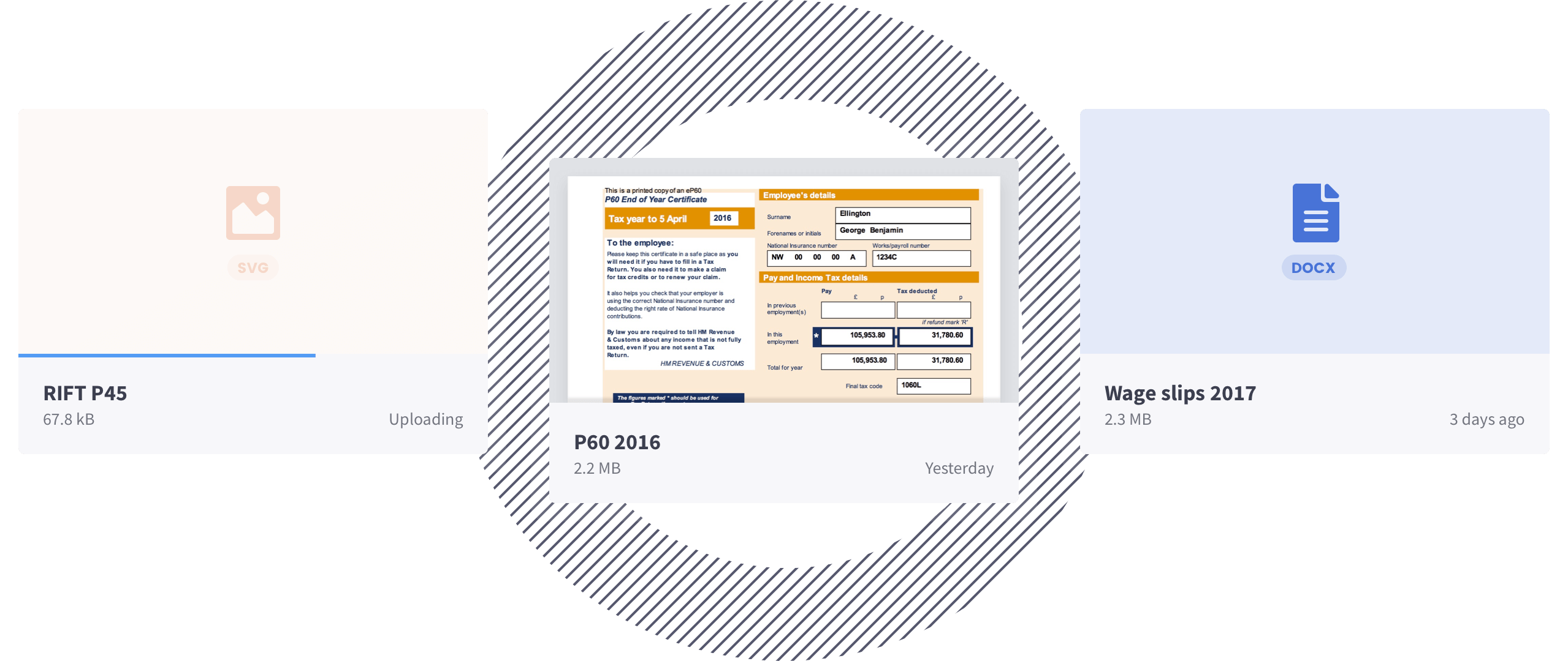
A collection of files showing the types of documents a RIFT customer can upload to the system. These files range from payslips, reciepts and P45 documents.
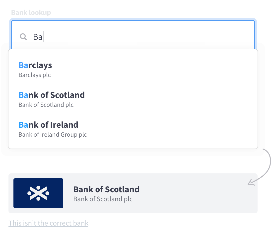
An efficient autocomplete search field for looking up a bank. In this example, simply typing two letters returns three different options for the user to choose from.

Make it easy to give high-quality data

Small improvements to a booking flow can have a big impact on the quality and quantity of data you’re able to capture.

Rather than asking the user to enter every detail themselves, we used unique details like postcodes and registration numbers to lookup entire home addresses, employers, and vehicle details. To help customers select the bank account their refund was paid into, we also created a lookup that offered real-time suggestions; for example, ‘The Co-operative Bank’ will be recommended even if a user types 'Co-op bank’, or even 'Britannia’, who they merged with in 2009.

Arrow

99.8%

address accuracy.

The 20,000 addresses captured in April 2020 were precise enough to successfully plot coordinates on a map in all but 50 cases.

Arrow

99%

vehicle accuracy

The 5,000 vehicles captured in April 2020 had a valid registration number, make, and model, in all but 50 cases.

The outcome

Happy customers. Happy client

Such was the success of our initial work with RIFT, we're continuing to work together well into 2020.

The pre-registation questionnaire and amended processes significantly improved conversion to registration, getting more and better qualified leads into the app, and increasing the number of claims submitted online.

Arrow

192%

increase in claim submissions.

Claim submissions have almost quadrupled in the past 2 years, with more than 5,000 claims submitted in April 2020 alone.

Arrow

84%

increase in unqiue sign-ins.

The number of people using MyRIFT each month has increased significantly, with over 8,000 active users in March and April 2020.

A collection of positive Trustpilot reviews. They all show a five star rating except for one, which offers a four star rating instead.