Themes
Consultancy, product design
Deliverables
Wireframes, prototypes
Technology
React Native, Node, GraphQL
Platform
iOS, Android

What is it?
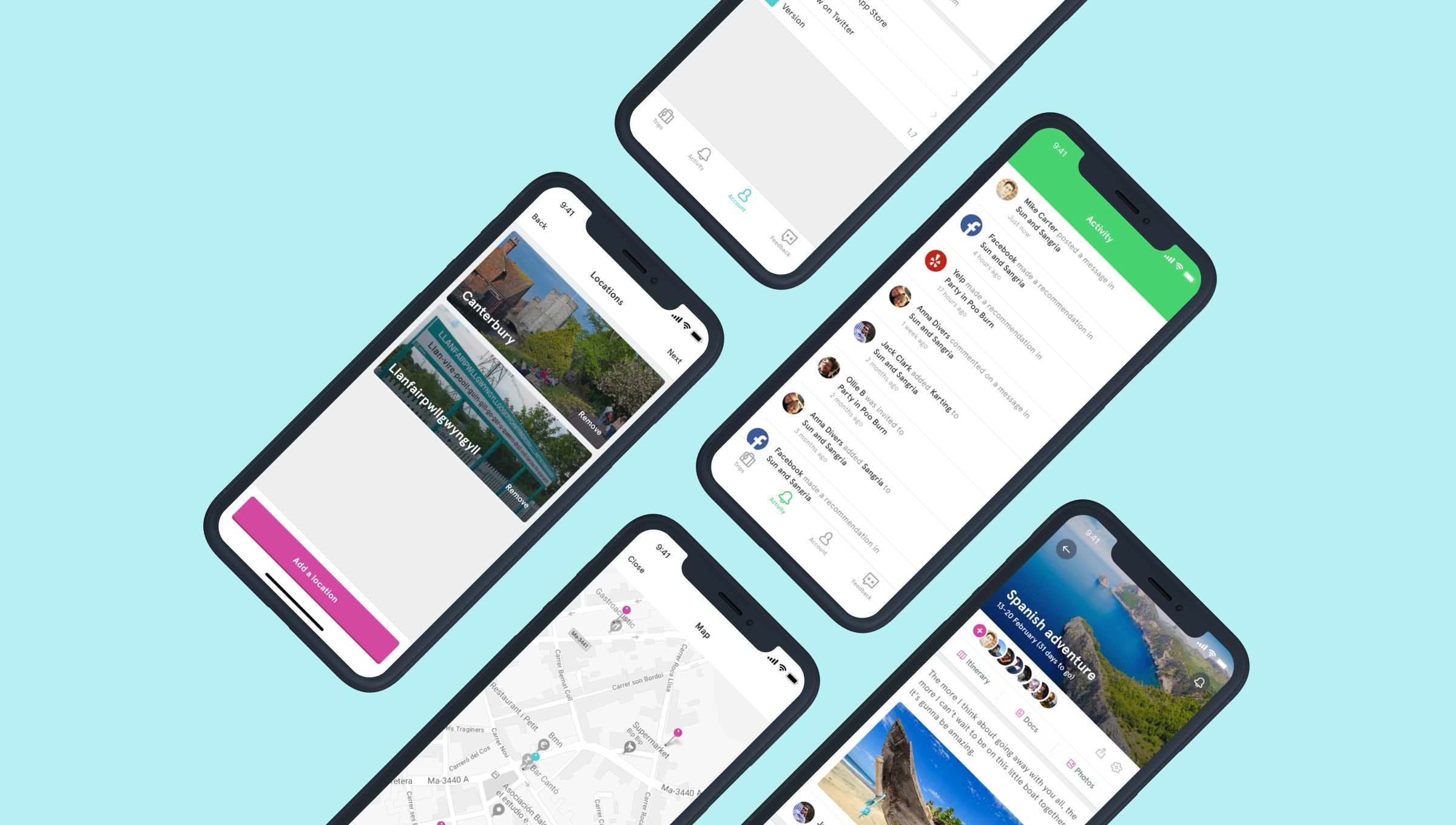
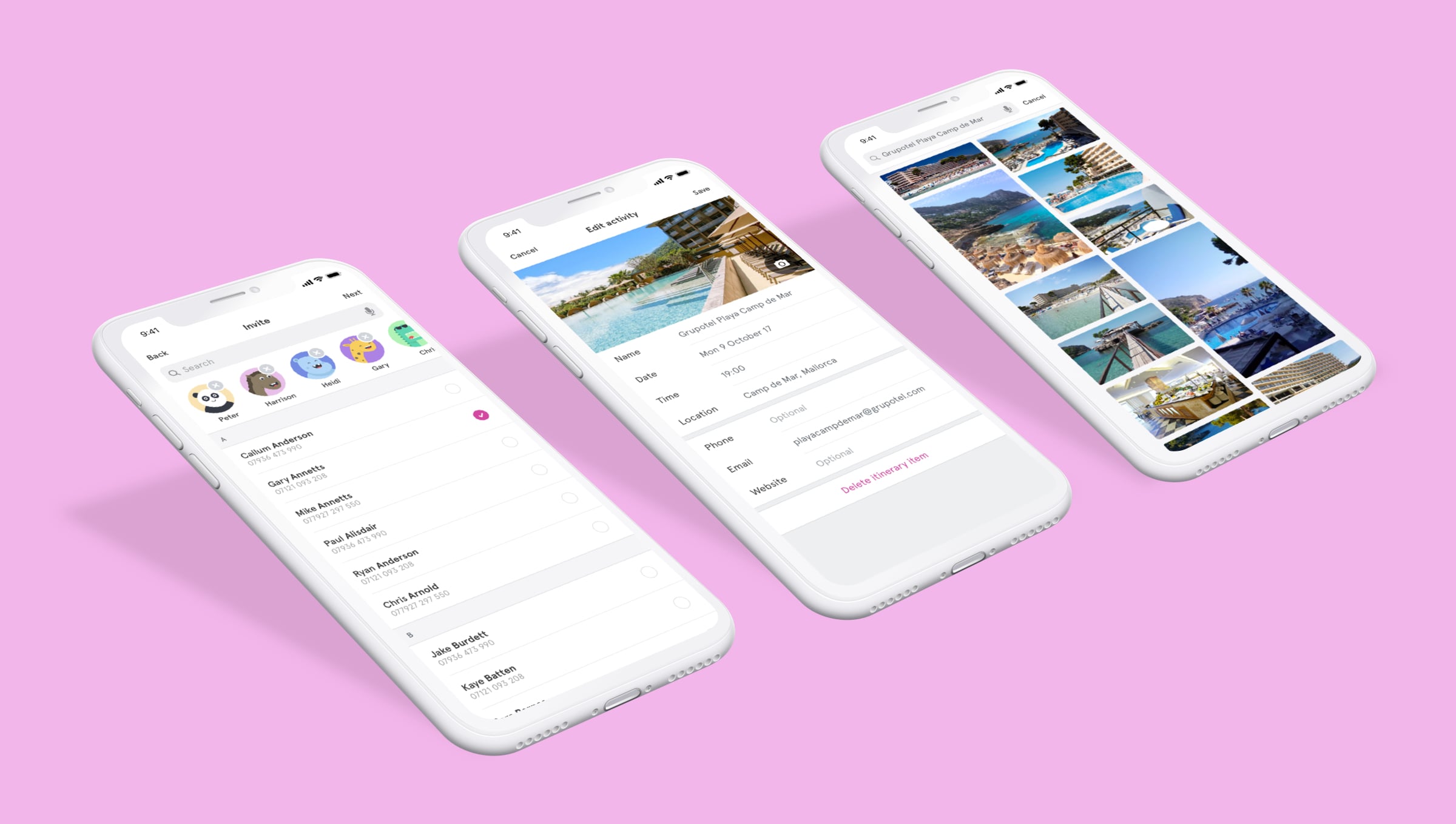
HEHA! is a trip-planning app, allowing travellers to manage everything from booking confirmations, to creating shared, collaborative itineraries.
The challenge
As an incubated startup, the HEHA! team had a small window of opportunity to get a minimum viable product (MVP) of their travel-planning application to market. We were brought in to help their users create and manage their get-away, capturing everything from destinations and dates to travellers and trip themes.
Our approach
Very early on in the project, we spoke at length with the Holiday Extras Call Centre staff to better understanding the most common travel-related pain-points. Through speaking to thousands of trip-planning customers a day, the Holiday Extras team would undoubtably have spotted recurring themes, and we want this insight to drive our own decision-making.
Flexible solutions for flexible travellers
Research conducted with various stakeholders showed that there was an incredible variance in how people planned their trips. Many would start planning with just a date or destination in mind, while others didn't mind where or when they went, but knew what type of holiday they wanted.
To cater for all types of travellers, we need a trip creation process that allowed the user to:
- Add a single traveller, multiple travellers, or no traveller at all.
- Add a single destination, multiple destinations, or no destination at all.
- Add trip dates (optionally).
- Add the purpose of the trip (optionally).
- Add the type of activities they're interested in (optionally).
Each piece of information we gathered would directly impact the suggestions we made to the user. A traveller using HEHA! to plan a hen do, for example, would see a radically different feed of information to someone planning a golf trip.
To keep the application both useful and relevant for travellers with flexible requirements, we relied heavily on sensible defaults, offering popular content and recommendations where users hadn't yet figured out the specifics of their trip.

Custom design patterns for specific needs
To cater for the flexibility travellers needed, the destination lookup was designed from the ground-up. Google's Places API allowed us to automatically suggest locations to the user as they typed, reducing the risk of spelling mistakes, and resulting in a higher-quality of data captured for the HEHA! team.
The outcome
HEHA! launched in both the App Store and Google Play Store in the summer of 2017, and has found favour with an increasing number of active users and trip creators.
We're continuing to work with the HEHA! team, refining the application and making trip planning not only more collaborative, but more fun.